
en
Lee en nuestras aplicaciones:
iOS
·Android
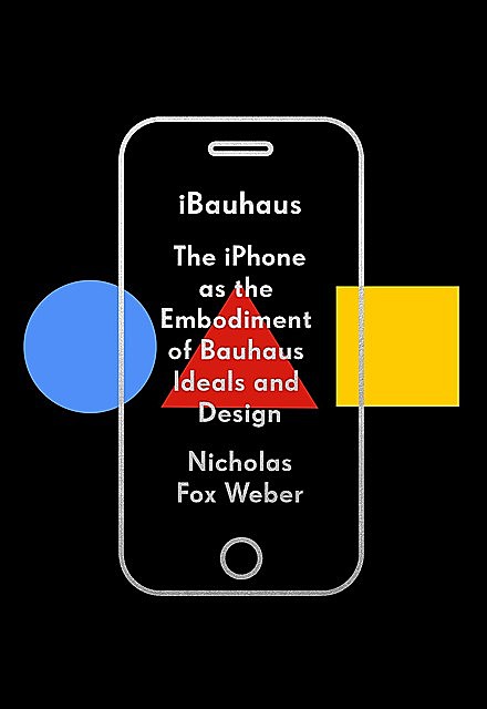
iBauhaus
- Descripción
- Citas91
- Lectores5
- En las estanterías
- Natalyacompartió una citahace 3 años
 Since its launch in 2007, the iPhone has brought out a series of new models. To date, it keeps getting slightly larger—like a child growing up (in this case slowly). Like a true classic, for all its advances within, on the surface it remains essentially the same—in its sleek sheath, with the overall covering remaining simply a new variation of itself. This is true to the Bauhaus mentality: if a form has been carefully developed, and succeeds, one should stick to it.
 - Natalyacompartió una citahace 3 añosIn honor of its own thirtieth birthday, this glossy eatery purportedly used Josef Albers’s stencil lettering for outdoor signage and throughout a cookbook. One might have assumed that this was simply a borrowing of Albers’s beautiful alphabet, of which the original glass letters are at the Museum of Modern Art in New York, and which have been reproduced and exhibited in numerous places as the Bauhaus masterpiece they are. The River Café, however, did not simply adapt an idea; they claim, in the cookbook, that this is indeed Josef’s lettering. The main offense is not that they failed to obtain the requisite permission to do this. The travesty is that they changed the proportions of each of the letters so as to render them illegible. Josef’s alphabet is a model of careful dimensions based on perfect squares and circles, and parts or combinations thereof. Josef kept these underlying units meticulous and exact, and organized them so that the resultant letters are perfectly readable. The River Café has taken this alphabet and compressed and elongated or widened and fattened the forms, so that what should be perfect half circles are now like half circles in a funhouse mirror. They have changed the dimensions of the openings between elements, widening them so that the end results are almost impossible to read.
To be true to the Bauhaus is not to follow a “style.” It is to maintain impeccable standards, consider every nuance, and make successful functioning the priority. In 1974, Josef Albers told me that he had never been satisfied with the z of the alphabet he made in 1930. He had tried a mirror image of the s, but it did not read clearly. He had then worked and reworked triangles (that were precise half squares) and semicircles, but still the z was not sufficiently legible. Saying this to me, Josef handed over a photograph of his alphabet—the version in milk glass owned by the Museum of Modern Art. He had penciled in a z—there is none in MoMA’s version—following the y. The pencil on a glossy photo was faint but clear.
“At last, Nick! I have only now figured out the z! And you are the keeper of the z.” - Natalyacompartió una citahace 3 añosGropius ostensibly wanted to develop new buildings, but in fact there was never an architecture workshop at the school. The felicitous design of small objects was the true quarry of the school in both Weimar and Dessau.
- Natalyacompartió una citahace 3 añosBy the time Tanimoto developed his concept, it was well-known in the burgeoning field of communications that Thomas John Watson Sr., the genius behind IBM, had a sign saying “THINK” hanging prominently in his office. Tanimoto’s slogan called more for inventiveness than for reflection.
- Natalyacompartió una citahace 3 añosTanimoto would explain of the “Think Different” campaign: “It wasn’t what we were looking for, but it was everything that we needed.” That is a quintessentially Bauhaus attitude.
Rather than give himself credit for any special ingenuity, Tanimoto acted as if the idea for the game-changing slogan simply came to him. It was the same for the truest Bauhauslers. They never treated themselves as creators of ideas so much as the recipients of them. Klee and Kandinsky were grateful for inspiration without knowing its source. They were the opposite of the self-congratulatory “This is what I have done! Bravo me!” artists and architects of today. You could think that Mies’s Barcelona Pavilion simply found its way onto the architect’s drafting table. Anni Albers once wrote Florence Knoll, founder of the textile and design company Knoll, about a recent textile she wanted her to see: “Something new appeared on the loom.” - Natalyacompartió una citahace 3 añosSteve Jobs was desperate for Apple simply to survive when he again turned to Ken Segall, his public-relations guru, and demanded an image that would distinguish Apple from other companies.
Segall and his team decided to emphasize Apple’s radicalism. Rather than follow the usual rules, the company developed unprecedented approaches to human needs. Apple needed to be known for its pioneering spirit. Craig Tanimoto, the art director at Segall’s firm, came up with the slogan “Think Different.”
The jolting bad grammar seems a deliberate provocation. The use of an adjective when an adverb is required has now become the norm, but in the late 1990s people were not yet saying “They did good” when meaning that a sports team won a match, or the now prevalent “I’m good” when they were telling waitpersons they did not want their coffee topped up. “Think Different” was an example of what it advised, jarring in form as well as concept. - Natalyacompartió una citahace 3 añosAnd while for Jobs there was no issue of baldness, it is similarly significant that the symbol he chose was, for him personally, associated with a hippie commune. This man who became such a part of corporate America, of the world of Wall Street and stock prices and corporate takeovers and capitalism at its most excessive, had made the central image of his life one he associated with informality, sharing, smoking dope, a certain carefree, devil-may-care, joyous revelry, the world of people who would rather dance to the summer solstice naked than attend stockholders’ meetings to which CEOs have flown in private planes. The life of All One Farm was in his soul.
- Natalyacompartió una citahace 3 añosApples are sexual in many ways. Schapiro amplifies on Cézanne’s regular return to them:
The central place given to the apples in a theme of love invites a question about the emotional ground of his frequent painting of apples. Does not the association here of fruit and nudity permit us to interpret Cézanne’s habitual choice of still-life—which means, of course, the apples—as a displaced erotic interest?
One can entertain more readily the idea of links between the painting of apples and sexual fantasy since in Western folklore, poetry, myth, language and religion, the apple has a familiar erotic sense. It is a symbol of love, an attribute of Venus and a ritual object in marriage ceremonies. Fructus—the word for fruit in Latin—retained from its source, the verb fruor, the original meaning of satisfaction, enjoyment, delight. Through its attractive body, beautiful in color, texture and form, by its appeal to all the senses and promise of physical pleasure, the fruit is a natural analogue of ripe human beauty. - Natalyacompartió una citahace 3 añosCézanne’s 1880 Judgment of Paris shows Paris handing over a bounteous bowl of apples. The centerpiece and focal point of the complex canvas, the ripe fruit is a perfect symbol of the attributes on Paris’s mind. The richness of the simple apple, and all the implications of the fruit, make it likewise a perfect symbol for the iPhone and the rest of Apple Computer’s communication products.
In one of his elegies…Propertius chants the love of a girl won by ten apples. Addressing Virgil, whom he hails as greater than Homer, the poet writes: …
You sing beneath the pines of shady Galaesus
Of Thyrsis and Daphnis with the well-worn pipes;
And how ten apples can seduce a girl
………………………………..
Happy man, who can buy love cheaply with apples!
Schapiro will show that for Cézanne, apples represented acts of giving as expressions of love.
Using the fruit he saw in such quantity at All One Farm as the logo of his burgeoning computer company, Steve Jobs appreciated its association with bounty and with acts of generosity. - Natalyacompartió una citahace 3 añosOne of the reasons the iPhone is more true to Bauhaus values than many other Apple products has to do with the style of the apple. When it has bright stripes across it, as it does on the Apple II computer, it is garish. The stack of vulgarly colored rectangles represents a level of decoration few people at the Bauhaus would ever have condoned. It is only when the apple gets simplified to an austere, minimalist representation of the fruit that we are brought to the essentiality that was central to the highest standards of the Bauhaus.
fb2epub
Arrastra y suelta tus archivos
(no más de 5 por vez)